Cover: 1st Draft
- Chloe Reina
- Apr 12, 2025
- 1 min read

Updated: Apr 15, 2025
For our first drafts I was supposed to do two versions of the cover of my magazine. Meaning two ideas or options I have for the class to speak on about and for me to have a more open visual. Here I'll be explaining each of the version on what is in included in them and then why those were my options.

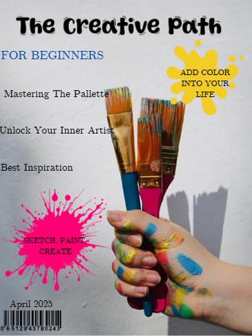


Version 1: The program I used to make these was "Canva". I decided to have the cover lines to the left where there's space from the picture so nothing in the background can be distracting but forgot one cover line. The main cover line is in blue to make it pop out from the rest. I kept the masthead in black with the font "Coffee Spark" and at the top. Then I added two puffs. One being a pink paint splash in the bottom left under the coverlines and another yellow paint splash in the top right under the masthead. Lastly, I have the barcode in the bottom left corner with the dateline right on top.
Version 2: The second version is all the same except here I added stars between each cover line because it looked empty and thought it would add more of an art style to it. Another way of doing that, I put in a blue wavy line under the main coverline. Everything else is the same.


Comments