Table of Contents: Final
- Chloe Reina
- Apr 14, 2025
- 2 min read

Here I'll be reflecting and comparing my first draft and final piece of table of contents. I'll be providing images to compare them. I'll be saying my thoughts through this process of making my magazine.
1st Draft: Final TOC:

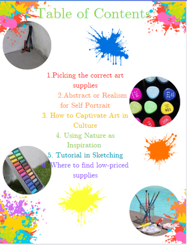


Now the TOC is what made me really stress out because I kept restarting it, not knowing which way I wanted to go with about my design and having to think about the homestyle too. I wanted my TOC to look like my cover and mature, but it kept coming out childish. Also, on the other hand not everyone wanted the same thing. I kept hearing opposite sides and would try to get a mix of them but that makes the process harder since I already didn't know where to go. I've made several designs of my TOC but have finally come upon this one and hope others agree with me too as I've done a lot to get here. My first TOC was plain, second outdid the entire magazine, and then this one I think it's clean but not too plain that also can deal with the homestyle because of the paint splashes all around. The differences are that I took away the pictures. Then added more articles and made them go in a zig zag way and to make the article I'm talking about to stick out, I put it in hot pink to match the title color. The articles went from the rainbow and in the font Serif to all black and in the font League Spartan. Instead of having random paint splashes all around, I made watercolor coming out of the sides. Then lastly, the title I switched it to the font coffee spark and changed it to the color hot pink.


Comments