Second Genre Photoshoot
- Chloe Reina
- Dec 5, 2024
- 2 min read

Updated: Apr 15, 2025
Now it's time to do the photoshoot of our second genre for the magazine. My second choice was Art & Design. We were to take 15-20 photos, and these are the top 5.
Art & Design

All my photos were taken in the Art District of Miami. This first photo is a garage gallery. I took it at a low angle from across the street to get a better views of the full design on the wall without the trees getting in the way. After it was taken, I cropped the bottom of the photo to not see the street and then put a filter on it to make it look more vibrant. After presenting it to the class the feedback I got back from my classmates was to try different angles. For example going right next to it and taking the photo looking up. Next time I'll experiment better with unique angles to capture a different point of view.
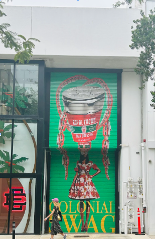
This one is a clothing store. I took it from across the street to catch the women walking in front of the art to give some life to it. Afterwards I put a filter on it to make the green, red and yellow pop out. The feedback I got from the class was that I took a good picture and edited it well that I captured the full design and colors.

Here the process was that I took it from at the end of street to get the whole front view of the building in the frame. This one I was really motivated to get because of the way this parking lot is designed. I have never seen one like that. I took the photo from low angle facing more towards the sky to not get any other interruptions in the street. For example, cars driving by and people walking in front of me. It was also to leave space in the top of the photo. The feedback I got and will try to experiment with next time will be to try a close up of the design.

This was hard to take a picture of because it's a famous piece that many people that were there were also trying to get photos with it. There was a big group of men with professional cameras taking pictures of it and people modeling next to it. Once everyone was done I was able to experiment with different angles and filters to see what gets it to look best clean and professional for a cover. For this I got the same feedback as the last one and will definitely try to experiment with it is close ups.

I had an imagination on how this could look as a cover and thought it would somewhat fit in with it. I wanted to get the full wall to see the original design which is the trees and leaf's and then the graffiti layered over it. This can be a point of view of a fancy street yet still have other type of art combined with it. I didn't get feedback back from my class on this one but in my opinion for next time I will like to capture it from a different angle.


Comments